INTRODUCTION
Data :
Data is the collection of information or facts. It may be a collection of numbers, figures, words or symbols.
Raw Data :
The data that has been collected in the original form is called raw data.
For example :
The marks obtained by 50 students in the Social Studies exam are 60, 40, 35, 27, 67, 72, 40, 37, 45, 50, 52 and so on up to 50 items.
This collection of data is raw data.
Observation :
Each of the items in the raw data is called an observation. The marks of each student stands for an observation in the raw data.
Type of Data :
· There are two types of data — primary data and secondary data.
· Primary data is the data collected directly from the source.
· Secondary data is the data collected from secondary sources such as the internet, TV, libraries,
newspapers. etc
For example :
Mr Sen asks the students to give their choice for the particular location they would like to go, the games they would like to play, the type of food they would like to have on their trip, he is getting the information directly from the source. This is primary data collection. When he is collecting information about weather, or accommodation facilities. he may collect these from the internet, travel brochures, newspapers, magazines, television and other souces. These sources are secondary sources is called secondary data.
Organisation of Data :
To draw a meaningful conclusion from the data, the data must be organized. Understanding and analyzing the data becomes easier when it is represented by pictures or tables.
Tabular form :
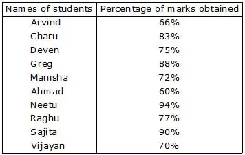
Consider the data given here 75%, 88%, Devan, Charu, Sajita, Arvind, 70%, 60%, 83%, 90%, 94%, Greg, Manisha, Vijayan, Ahmed, Raghu, Neetu, 66%, 77%, 72%. This is raw data.
The data given above are facts in words and figures. Unless the available data is property presented, we cannot get meaningful information from it. Given below is a tabular representation of the above data. This makes the information easy to understand.
Frequency distribution :
Let us study the peak hour traffic at a road junction to share it with the town or city addministrators to help them develop that junction for easy traffic flow. We need to collect the data about the number of trucks, cars, other motor vehicles, and cycles passing through that junction during a fixed period at the peak hour.
We will try to find the number of vehicles passing through that junction during the peak interval of 9.00 a.m. to 9.30 a.m.
For this you have to prepare a data collection sheet.
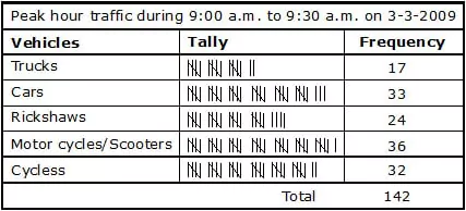
You find here two new words tally and frequency. Tally is a mark 'l' we put in the chart against each item. For example, if a car passes the junction, we mark one tally 'l' in the box against car. When four cars have passed, the tally will look like this "llll'. When the fifth car passes, we do not write 'lllll' but we put a cross across the four tallies like . This forms a group of 5. Similarly, ' ||' will be two fives and two, i.e., 12. The total value of the tallies in each row tells us the number of the particular type of vehicle which passed through that junction. In general, the tally mark represents the number of times that particular situation happened. This is called the frequrency of that event or that happening. In the case of trucks, 17 trucks passed through that junction between 9.00 a.m. and 9.30 a.m. Thus the frequency of the trucks passing during 9.00—9.30 is 17. And the frequency for cars is 33, and so on. Finally the investigation or data collection chart will look like this.
Representation of Data :
We have learnt how to collect the information and how to organize it using a frequency table. To represent the study of this data, we can draw graphs for this data. Pictographs and bar graphs are simple ways of representing this data.
PICTOGRAPH
A pictograph is the way of representing data using pcitures.
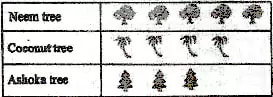
In a school compound, there are 5 Neem trees, 4 Coconut trees and 3 Ashoka trees.
Let us represent the above data by a pictograph.
Trees in the school compound
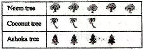
Let us now suppose that there are 40 neem trees, 24 coconut trees and 32 ashoka trees, you cannot draw each picture for each tree. So we take a convenient scale. Let us consider that each tree drawn represents 8 actual trees. 40 neem trees well become 5 trees drawn. Similarly, 24 coconut trees will be 3 and 32 ashoka trees will be represented by 4 trees. Now it is convenient to draw a graph.
Make sure that each picture must be one below the other.
Reading and intrepreting pictograph :
Reading a pictograph helps in intrepreting the pictograph so as to get information from it.
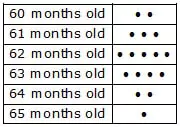
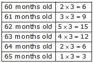
Ex. Given below is a pictograph of ages of students in a class of 51 students.
Key : · represents 3 students
Answer the following questions.
(i) What is the total number of students ?
Sol. · represent 3 students and here we have 17 such
· \ Total no. of students = 17 × 3 = 51
(ii) Which age group has the lowest number of students ? How many students are there in group.
Sol. 65 month old age group has the lowest number of students. Three students are there in group.
(iii) Which age group has the highest number of students ?
How many students are there in the group ?
Sol. 62 months old age group has the highest number of students. 15 students are there in the group.
(iv) How many students are there, who are 62 months and below ?
Sol. · represents 3 students and here we have 10 such
· who are 62 months and below
\ Total no. of students who are 62 months & below = 10 × 3 = 30
(v) How many students are 62 months and above ?
Sol. · represents 3 students and here we have 12 such
· who are 62 months and above
\ Total no. of students who are 62 months & above = 12 × 3 = 36
(vi) How many students are between the age of 61 months and 64 months ?
Sol. · represent 3 students and here we have 9 such · who are between the age of 61 months and 64 months
\ Total no. of students who are between the age of 61 months and 64 months = 9 × 3 = 27.
BAR GRAPH
When the given data is large and also not in multiples of a number, it is difficult to draw pictographs. When numerial data is presented as columns on a graph, this graphical representation of data is called a bar graph. It is also known as column graph.
Properties of Bar Graphs :
In a bar graph, the columns are drawn such that :
(a) Each column is of equal width.
(b) There is equal space between each column.
(c) The height of each column indicates the value of data such that if a perpendicular is drawn from its top to ray OY, the percentage of marks represented by the column can be read off.
(d) All bars or columns are draw on the same common base.
(e) To make the bar graph attractive, the bars may be coloured.
(f) Bars are very helpful for visual comparison of data.
Construction of a bar graph :
STEPS :
1. On the graph paper draw a horizontal line (x-axis) and a vertical line (y-axis)
2. Along the horizontal line, mark points at equal distances and write the names of the items for which the data is to be represented.
3. Choose a suitable scale which shall determine the height of the bars.
4. Locate the heights of different bars according to scale.
5. On x-axis draw bars of equal width according to the required height.
6. Keep the distance between the bars the same.
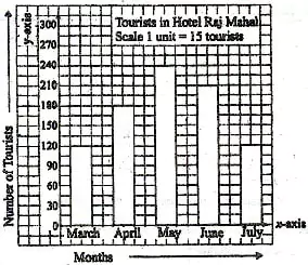
Ex. Look at the frequency chart representing the number of tourists staying in Hotal Raj Mahal in Shimla for 5 months : March, April, May, June and July.
Months Tourists
March 120
April 180
May 240
June 210
July 120
Take a graph paper or a squared paper. Draw a horizontal axis at the bottom. On the lift side draw a vertical axis. Take an appropriate scale. In this case, let it be 1 division (1 centimetre) equal to 15 tourists.
On the horizontal axis, represent the five months separately with equal width and equal distances between them.
Reading of bar graphs :
Reading of the bar graph is the process of interpreting the bar graph to gather information.
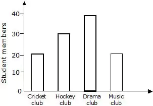
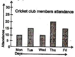
Ex. Read the bar graph given below and answer the following questions.
(i) What is the total number of students in all the clubs together ?
Sol. 20 + 30 + 40 + 20 = 110 students
(ii) Which club has more students and how many ?
Sol. Drama club, 40 students.
(iii) Which club have equal number of students ?
Sol. Cricket club and music club.
(iv) How many students are there in hockey club ?
Sol. 30 students.
(v) What information is given in the bar graph ?
Sol. The bar graph represents the number of members of different sports clubs.
AVERAGE
Average =
Ex. Find the average of all prime numbers between 30 and 50.
Sol. There are five prime numbers between 30 and 50.
They are 31, 37, 41, 43 and 47
\ Required average = (31+37+41+43+47)/5
= 199/5
= 39.8
Ex. Find the average of first 5 multiple of 7.
Sol. Required average = (7+14+21+28+35)/5
= 105/5
= 21
OBJECTIVE TYPE
Q.1 If one symbol  represents 150 trees, then the number of trees represented by are
(A) 600 (B) 700 (C) 750 (D) 500
Direction : (Q. 2 to Q. 5)
Using the given bar graph, choose the correct option in the questions given below :
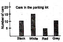
Q.2 Which colour is the least colour common among the cars in the parking lot ?
(A) black (B) white (C) red (D) grey
Q.3 Which colours had the same number of cars parked ?
(A) Black and Grey (B) White and Black (C) White and Red (D) Grey and White
Q.4 What is the ratio of the number of white cars to red cars ?
(A) 5 : 2 (B) 2 : 5 (C) 3 : 1 (D) 1 : 3
Q.5 The total number of cars in the parking lot was
(A) 20 (B) 35 (C) 50 (D) 40
Q.6 The picture graph shows the capacity of 4 containers.
Which container has a capacity of 1/2 litre ?
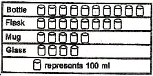
(A) Bottle (B) Flask (C) Mug (D) Glass
Q.7 Total numbers of animals in five villages are shown in the following table.

If one symbol Å represents 10 animals, the total number of symbols required to represent animals for village C will be :
(A) 5 (B) 7 (C) 8 (D) 9
Q.8 The following pictograph shows the number of varieties of apples stored in a supermarket. The total number of apples stored in the supermarket is
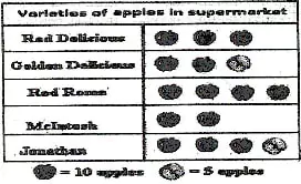
(A) 150 (B) 100 (C) 50 (D) 16
Q.9 Final marks of 20 students are as follows :
53, 61, 48, 60, 78, 68, 55, 100, 67, 90, 75, 88, 77, 37, 84, 58, 60, 48, 62, 56 What is the lowest score ?
(A) 37 (B) 100 (C) 62 (D) 48
Q.10 Find the average of first 5 prime numbers
(A) 5 (B) 6 (C) 7.6 (D) 5.6
Q.11 The average of first five multiples of 2 is
(A) 3 (B) 5 (C) 6 (D) 8
Q.12 The arithmetic mean of the numbers 12, 19, 13 and 16 is
(A) 12 (B) 13 (C) 14 (D) 15
SUBJECTIVE TYPE
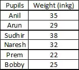
Q.1 The table below shows the number of students playing four different games :
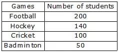
Present this information as a pictograph.
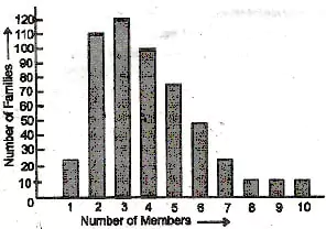
Q.2 Read the bar graph in the figure and answer the following questions :
(i) What is the information given by the bar graph ?
(ii) What is the number of families having 6 members ?
(iii) How many members per family are there in the maximum number of families ? Also tell the number of such families.
(iv) What are the number of members per family for which the number of families are equal ? Also tell the number of scuh families.
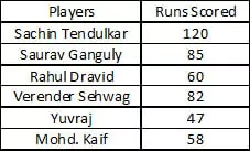
Q.3 Draw the bar graph of the following data.
Q.4 Draw the bar graph of the following data
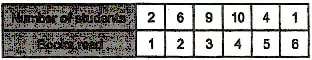
Q.5 Read the graph and answer.
Fill in the chart and prepare a frequency table.

Q.6 A class took a vote to decide where to go for a trip.
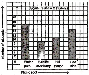
(a) How many students are there in the class ?
(b) Where did the majority of students want to go ?
(c) Which was the second choice ?
(d) How many students voted for water park ?
Q.7 Make a bar graph for the following data.
(a) The table shows the number of books read by the class in the past month.
(b) This is the daily routine of Shankar. Make a bar graph representing the time and activities.
Activity Time (hours)
School 6
Sleeping 9
Playing + hobby 3
TV watching 2
Eating + Drinking 1
Other activities 3
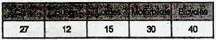
(c) This is the result of a traffic survey conducted by Anil in front of his village house for 1 hour.
(d) For the 'Marathon Run for Peace' programme a big group of children took part. The age—wise details of participants are given below.
.JPG)
Q.9 The music group of Class Vl of St. George's School performed a musical programme. The students of Class Vll were asked to grade the programme in a scale of 5 where 1 represents excellent performance, 2 good, 3 ordinary performance, 4 not good, 5 very poor show. This is the result of 80 students of Class Vl.
4, 2, 5, 2, 4, 5, 3, 4, 3, 2, 5, 5, 3, 2, 4, 5, 4, 5, 4, 4, 3, 3, 4, 3, 4, 3, 5, 5, 4, 3, 2, 5, 4, 4, 3, 3, 4, 4, 5, 5, 4, 3, 2, 5, 4, 4, 5, 3, 3, 4, 4, 3, 3, 4, 5, 5, 3, 2, 4, 3, 5, 4, 3, 2, 4, 2, 4, 3, 3, 4, 2, 4, 4, 3, 4, 2, 4, 4
Prepare a frequency table using tally marks.