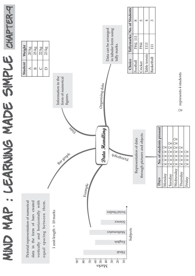
DATA HANDLING
1. A data is a collection of numbers gathered to give someinformation.
2. Data obtained in the original form is called rawdata.
3. To get particular information from the given data quickly, the data can be arranged in tabular form using tallymarks.
4. The representation of information through pictures is called apictograph.
5. Data can also be represented through bar graphs. In a bar graph, bars of uniform width are drawn horizontally
or vertically with equal spacing between them. The length of each bar gives the required information.
Frequency
Frequency is the number of times a particular value occurs in a given data.
Eg: Marks scored by different students in a class: 1, 2, 2, 4, 3, 3.

Organised Data
• Data should be organised properly.
• This helps in extracting information.
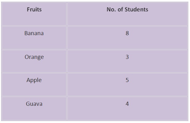
• Example: In a class, 20 students were asked to choose one fruit from Banana, Orange, Apple and Guava.
• The following shows organised data for the above information is given below.
Prioritizing Data
Data can be prioritized or it can be organised in a particular order according to importance.
Example: Following are the names of students in a class: Anu, Shameer, Kiran, John. Prioritize the data
according to alphabetic order. On prioritising the data, the new order of names become Anu, John,
Kiran and Shammer.
How to organise data?
Data can be organised in different ways. It can be organised in
(i) Alphabetical order
(ii) In ascending and descending order.
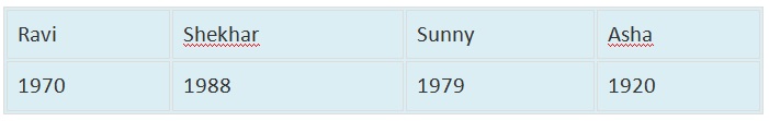
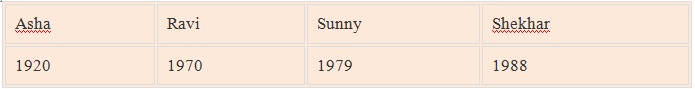
Example: Arrange the following data according to the birth year.
Organised data:
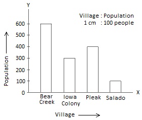
Scaling Factor
The large numbers cannot be represented in a bar graph, so the scaling factor is used to
reduce or scale down large numbers.
Pictographs
• The pictograph is a pictorial representation of data.
• Here data is represented using images of the objects.
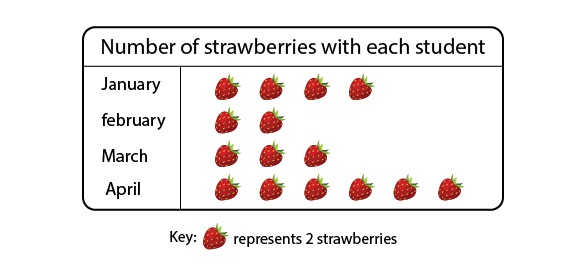
Interpretation of pictographs
The number of strawberries eaten by various people is shown below.

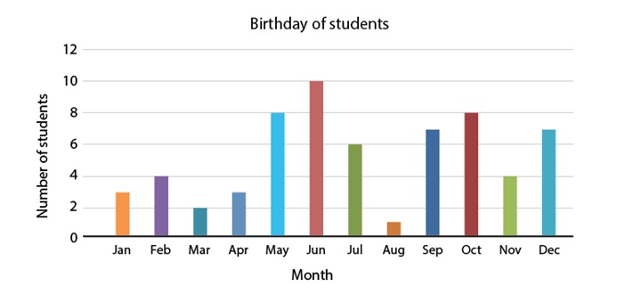
Bar diagrams
The graphical representation of data using bars of uniform width drawn vertically or horizontally
with different lengths is called as bar graphs/bar diagrams.
Bar diagrams consist of two axes: X-axis and Y-axis.
The following is a bar graph showing the birthday of students in a class.
Interpretation of bar diagrams
Given below are the marks scored by students in mathematics. Calculate the sum of marks scored by A and C.
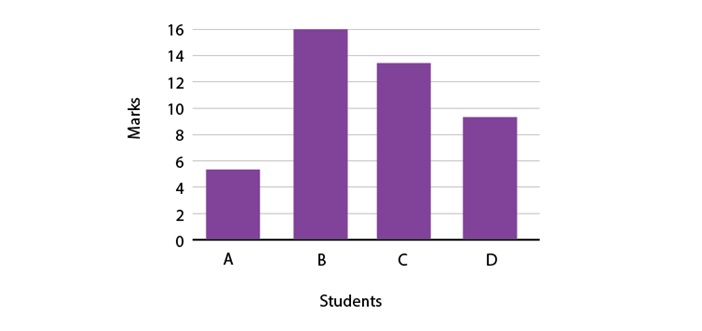
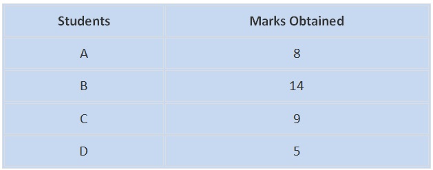
Sum of marks scored by A and C = 8 + 9 = 17
∴ The required sum is 17.
Collection of numbers gathered together to give some valuable information is called data. Pictograph shows
numerical information by making use of icons or picture symbols to represent data sets. Pictograph can also
be defined as a visual presentation of data using symbols, pictures, icons, etc.
Bar graph
A bar graph is also called a bar chart. It is used to represent data visually with the help of bars which are of
different heights or lengths. The date graphed is either horizontally or vertically, to make it easy for the
viewers to compare different values and therefore draw conclusions quickly.
The three major attributes of bar graphs are:
The bar graph helps to compare the different sets of data among different groups easily.
It shows the relationship using two axes, in which the categories on one axis and the discrete values on the other axis.
The graph shows the major changes in data over time.
Types of Bar Graphs
The bar graphs can be vertical or horizontal. The primary feature of any bar graph is its length or height.
If the length of the bar graph is more, then the values are greater than any given data.
Bar graphs normally show categorical and numeric variables arranged in class intervals. They consist of an
axis and a series of labelled horizontal or vertical bars. The bars represent frequencies of distinctive values
of a variable or commonly the distinct values themselves. The number of values on the x-axis of a bar
graph or the y-axis of a column graph is called the scale.
The types of bar charts are as follows:
Vertical bar chart
Horizontal bar chart
Even though the graph can be plotted using horizontally or vertically, the most usual type of bar graph used
is the vertical bar graph. The orientation of the x-axis and y-axis are changed depending on the type of
vertical and horizontal bar chart. Apart from the vertical and horizontal bar graph, the two different types
of bar charts are:
Grouped Bar Graph
Stacked Bar Graph
Vertical Bar Graphs: When the grouped data are represented vertically in a graph or chart with the help of bars,
where the bars denote the measure of data, such graphs are called vertical bar graphs. The data is represented
along the y-axis of the graph, and the height of the bars shows the values.
Horizontal Bar Graphs: When the grouped data are represented horizontally in a chart with the help of bars,
then such graphs are called horizontal bar graphs, where the bars show the measure of data. The data is
depicted here along the x-axis of the graph, and the length of the bars denote the values.
Grouped Bar Graph: The grouped bar graph is also called the clustered bar graph, which is used to represent
the discrete value for more than one object that shares the same category. In this type of bar chart, the total
number of instances are combined into a single bar. In other words, a grouped bar graph is a type of bar
graph in which different sets of data items are compared. Here, a single colour is used to represent the
specific series across the set. The grouped bar graph can be represented using both vertical and
horizontal bar charts.
Stacked Bar Graph: The stacked bar graph is also called the composite bar chart, which divides the aggregate
into different parts. In this type of bar graph, each part can be represented using different colours, which
helps to easily identify the different categories. The stacked bar chart requires specific labelling to show
the different parts of the bar. In a stacked bar graph, each bar represents the whole and each segment
represents the different parts of the whole.
Properties of Bar Graph
Some of the important properties of a bar graph are as follows:
• All the bars should have a common base.
• Each column in the bar graph should have equal width.
• The height of the bar should correspond to the data value.
• The distance between each bar should be the same.
Applications of Bar Graphs
Bar graphs are used to match things between different groups or to trace changes over time. Yet, when trying
to estimate change over time, bar graphs are most suitable when the changes are bigger.
Bar charts possess a discrete domain of divisions and are normally scaled so that all the data can fit on the graph.
When there is no regular order of the divisions being matched, bars on the chart may be organized in any order.
Bar charts organized from the highest to the lowest number are called Pareto charts.
Advantages and Disadvantages of Bar Chart
Advantages:
• Bar graph summarises the large set of data in simple visual form.
• It displays each category of data in the frequency distribution.
• It clarifies the trend of data better than the table.
• It helps in estimating the key values at a glance.
Disadvantages:
• Sometimes, the bar graph fails to reveal the patterns, cause, effects, etc.
• It can be easily manipulated to yield fake information.
Difference Between Bar Graph and Histogram
The bar graph and the histogram look similar. But it has an important difference. The major difference between
them is that they plot different types of data. In the bar chart, discrete data is plotted, whereas, in the histogram,
it plots the continuous data. For instance, if we have different categories of data like types of dog breeds, types
of TV programs, the bar chart is best as it compares the things among different groups. For example, if we have
continuous data like the weight of the people, the best choice is the histogram.
Difference Between Bar Graph and Pie Chart
A pie chart is one of the types of graphical representation. The pie chart is a circular chart and is divided into parts.
Each part represents the fraction of a whole. Whereas, bar graph represents the discrete data and compares one
data with the other data.
Difference Between Bar Graph and Line Graph
The major difference between bar graph and line graph are as follows:
The bar graph represents the data using the rectangular bars and the height of the bar represents the value
shown in the data. Whereas a line graph helps to show the information when the series of data are connected
using a line.
Understanding the line graph is a little bit confusing as the line graph plots too many lines over the graph.
Whereas bar graph helps to show the relationship between the data quickly.
Draw a Bar Graph
Let us consider an example, we have four different types of pets, such as cat, dog, rabbit, and hamster and the
corresponding numbers are 22, 39, 5 and 9 respectively.
In order to visually represent the data using the bar graph, we need to follow the steps given below.
• Step 1: First, decide the title of the bar graph.
• Step 2: Draw the horizontal axis and vertical axis. (For example, Types of Pets)
• Step 3: Now, label the horizontal axis.
• Step 4: Write the names on the horizontal axis, such as Cat, Dog, Rabbit, Hamster.
• Step 5: Now, label the vertical axis. (For example, Number of Pets)
• Step 6: Finalize the scale range for the given data.
• Step 7: Finally, draw the bar graph that should represent each category of the pet with their respective numbers.